

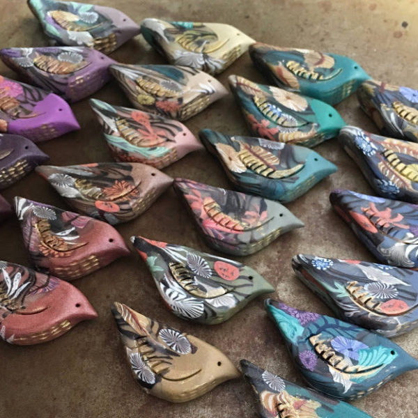
This month’s challenge artwork, Heijinja by Toshi Yoshida, is lovely for its peacefulness and delicate use of line. On a quick glance, you might only see a handful of colors, but with a closer look, you’ll see lots of muted shades – grays, blues, pinks, yellows, and taupes.
What stands out immediately is the red building; with such a strong color, how can it not be the first thing your eye sees? I love how it warms up an otherwise cool palette, but I especially love the overall color scheme. It’s not something I would immediately choose, but all of the shades really work well together.
How do we use them? One way to incorporate the colors into your challenge piece is to choose a bold shade of red and keep everything else very soft and muted – the last five swatches would be a great palette. Or, if you like color, you can challenge yourself and do the top four or five swatches, working to mix in a soft yellow and light pink with the red.
What do you think of this month’s artwork? How do you plan to use the colors in it?
Beaditi
February 6, 2013 at 2:50 pmBrandi, thanks for calling out some lovely possibilities with the color palette here !
I think Im going to make one more piece, and skip the red…
Kaushambi
Kathy Lindemer
February 6, 2013 at 8:57 pmI don't have many red beads so I am trying to work around the red.
YaY! Jewelry
February 13, 2013 at 2:44 amI have some read beads that would be perfect. Getting to many irons in the fire!!!!