Welcome to Studio
Saturday! Each week one of our contributors gives you a sneak peek into
their studio, creative process or inspirations. We ask a related
question of our readers and hope you’ll leave comments! As an incentive
we offer a free prize each week to bribe you to use that keyboard.
The following week we choose a random winner.
This week’s winner is Kayz Kreationz.
Congratulations! You have won a set of bittersweet disk beads from Heather Powers of Humble Beads.
Send Heather an email with your address and
she will get your prize out to you soon.
~~~~~~~~~~~~~~~~~~~~~~~~~~~~~~~~~~~~~~~~~~
~~~~~~~~~~~~~~~~~~~~~~~~~~~~~~~~~~~~~~~~~~
Hello! Right
now, I’m working on magazine submissions. Today, I invite you inside my
studio to take a sneak peek at the materials I’m creating with for the
Spring 2014 issue of Jewelry Stringing Magazine!
It’s time to submit jewelry designs for next year’s Spring issue, now.
And yep, I’m actually sharing with you exactly what I’m working on for
the pieces I plan to submit to the magazine. That might seem kinda crazy, but I embrace the idea of freely sharing information that might help someone else find success in getting published. I thought it’d be fun to do a little show and tell to give you a glimpse of my process. I hope this information will help other designers feel
more confident about creating jewelry for publication.
Getting your jewelry published can be a tricky thing. Personally,
I find that challenge fun! There’s absolutely no guarantee that
anything I make will be selected. All I can do is try my best to follow
the magazine’s guidelines, let the themes and color palettes provided
inspire ideas for my designs and stay true to my own style, esthetic and creative process.
Jewelry Stringing is one
of my all-time favorite beading magazines. I’m intrigued and captivated
by the themes and color palettes the editors come up with to
inspire their contributing designers. Come join me now and get a taste
for what I’m working on and my process for creating jewelry pieces for
this particular magazine. I hope to inspire you to work on your own creations as
well and submit your designs.
Jewelry Stringing
provides guidelines, themes and color palettes for each one of their
upcoming issues. You can find the full details and guidelines for
submission here. I’ve provided some of the information for the Spring 2014 issue here in this post.
The
first theme and color palette for Spring 2014 is “Soft Jewelry”. (The
following description is taken from the guidelines on the magazine’s
website.)
Soft Jewelry

|
Leather,
ribbon, cord, thread, embroidery floss, and fabric are most commonly used as
stringing materials and structural components in jewelry pieces, but they also
lend themselves to creative and compelling focal elements. Submissions in this
category will range in style, but they should all include fibers, textiles, or
leather as a prominent design feature. Consider highlighting these materials
through techniques like knotting, braiding, and wrapping, or incorporating
current trends like fringe or tassels into your designs.
See their Pinterest inspiration board for
this palette at:
http://pinterest.com/stringingmag/soft-jewelry-spring-2014/ |
| So, here’s what I’ve chosen to work with for this theme:
As
you can see, I’ve matched up pretty well with the first two colors in the palette
provided. You do not have to use all the colors in the suggested palette, but at least one color in your design should match up. I chose these African trade beads in “Teal” from Ornamentea.com.
For additional color, texture and the fiber elements needed for the
theme, I hand-knotted the beads on multiple strands of Irish Waxed linen
cord in “Sunflower”. Then, I’ll pair the knotted beads with some brown
Greek leather cord to complete the design.
The
second theme and color palette for Spring 2014 is “Spring Greens”. (The
following description is taken from the guidelines on the magazine’s
website.) |
If there is one color that ubiquitously
represents springtime, it has to be green. Fresh leaves sprout from the trees,
grass peeks out from beneath snowdrifts, and budding shoots speckle our garden
beds. From subdued mossy shades to high-energy lime tones, each piece in this
category will celebrate spring in all its green glory.
See their Pinterest inspiration board for
this palette at:
http://pinterest.com/stringingmag/spring-greens-spring-2014/
Here are some materials I’ve chosen to use for this palette and theme:
I’ve got some hand-painted Shimmer Floss ribbon in “Grandma Moses” from Ornamentea.com, green, faceted Czech glass beads, Irish Waxed Linen in “Dark Forest Green” from Jewelry Accord and a matte gold button from the fabric store.
In this palette, I did want to match up with as many of the green colors as I could. The hand-painted shimmer floss helps me pull quite a few of the green
tones in the palette with just that one element. I’ll pull in the
darkest green color with the waxed linen cord. Then, I’ll pair the
fibers with the contrasting finish of the faceted Czech glass beads and
the button for balance and interest in the piece.
The
third theme for Spring 2014 is “Monochromatic”. (The following
description is taken from the guidelines on the magazine’s website.)
|
Monochromatic
   
|
|
In honor of our annual color issue, we
are inviting our contributors to create monochromatic pieces in the color of
their choice. While creating a piece in a single color simplifies the process
of selecting color-coordinated materials, it makes the other design elements of
the piece more visible. Balance, proportion, and symmetry are often
accomplished through clever color combinations. Without the aid of a varied
palette, designers must rely on their other skills to create well-executed,
interesting, and attractive jewelry. We know that you are up to the challenge,
so pick a color and show us what you’ve got!
See their Pinterest inspiration board for
this section at:
http://pinterest.com/stringingmag/monochromatic-spring-2014/ |
|
| Below is the color I’ve decided to go with for monochromatic: |
|
|
|
|
Grey Opaque Matte size 8 seed beads from ShipWreck Beads.
Yep,
Grey. Might not seem too exciting. Why in the world would I choose grey
out of all the beautiful colors of the rainbow? Well, the design I want
to make for this category will be elegant, sophisticated and a
little bit moody. That description could not be farther from how I would
describe my usual style. I’ve decided to go in this direction because
the color and look I have in mind is a total deviation from the esthetic
I would normally create. It’s fun to try different styles and show some
range in my work. That is very exciting to me! 🙂 I’m going to
incorporate these opaque, matte grey seed beads from ShipwreckBeads.com
into my jewelry piece by stringing them on multiple strands of grey waxed linen cord.
The multiple strands of these seed beads will provide texture and visual
interest to a monochromatic design.
Last,
but not least, the fourth theme for Spring 2014 is “Bead Soup”. (The
following description is taken from the guidelines on the magazine’s
website.)
Bead Soup

|
|
In
contrast to the previous theme, the pieces in this section will be packed with
colors-the more the better! We are challenging you to use as many different
colors as possible in your submissions for this category, but be careful that
you aren’t sacrificing cohesion or wear-ability for variety. Tip: Successful
“bead soup” pieces often have a unifying characteristic that runs throughout
each design (ie: consistent bead size, shape, finish or material; a repeated
technique; a specific theme or motif; etc.).
See our Pinterest inspiration board for this section
at:
http://pinterest.com/stringingmag/bead-soup-spring-2014/ |
Here are some beads I pulled from my stash for this category:
One hank of “All Mixed Up” size 8 Czech seed beads from Shipwreck Beads
and a graduated ceramic bead set from ceramic artist, Keith O’Connor. I
can’t think of a better way to get more colors in than these fantastic
seed bead mixes! They remind me a lot of the African “Christmas” or
“Love” trade beads, which would also be a great choice for this theme.
If you take a look at the Pinterest board for this category above, there
are images of African beadwork. So, obviously those would be an ideal
selection!
I hope you’ve enjoyed following along with me on my journey to creating jewelry for the Spring 2014 issue of Jewelry Stringing
magazine. I want to inspire you with ideas that you can use in your own
jewelry. If you’d like to try submitting your designs, here is the
deadline information and submission guidelines you’ll need to know:
E-mailed pre-submissions are due September 26th, 2013; physical submissions are due October 10th, 2013.
For the rest of the submissions instructions and specifics, please read through the Contributor Guidelines in their entirety here.
Do you submit your jewelry to any beading magazines?
Would you like to see your designs published?
Why or why not?
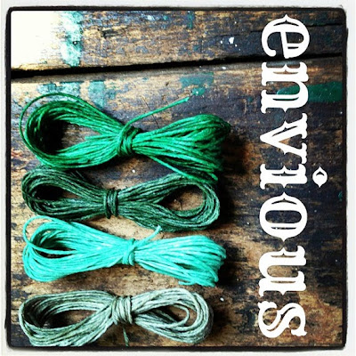
“Envious” Color Cord Mix from Jewelry Accord
Leave
a comment answering any of the above questions and you will be entered for a
chance to win an Irish Waxed Linen Cord Color Mix courtesy of the Jewelry Accord shop on Etsy!
By the way, this green color cord mix from Jewelry Accord would be an excellent material choice for jewelry project submissions to the “Spring Greens” color palette shown above!
Happy Beading!
Erin Siegel is a jewelry designer, beading instructor and co-author of
the jewelry book, Bohemian-Inspired Jewelry: 50 Designs Using Leather,
Ribbon and Cords. To find out more, visit her blog: Erin Siegel Jewelry.
|