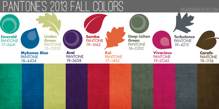
Pantone released their 2013 Fall Color picks back at the beginning of February, but I’ve been sitting on this post for a couple months now. Mostly because I really loved the Spring Colors and I wanted to enjoy them for a while. And partly because I didn’t want to think about fall yet.
But because creatives work several months in advance, and some of you might already be working on (or planning) fall pieces and shows, let’s go ahead and talk about the fall colors.
Very simply put, I love them. Love them. Take a look:
Overall, they’ve got a cooler tone to them, but a few are still nice and saturated (my favorite kind of color). Compared to Fall 2012, I like these colors better. They’re more saturated and closer to colors I personally favor, where Fall 2012 seemed a little dull to me. I’m also loving pretty much every shade, versus last fall, when I didn’t immediately react to choices like Honey Gold or Rhapsody. What do you think about this year’s picks?
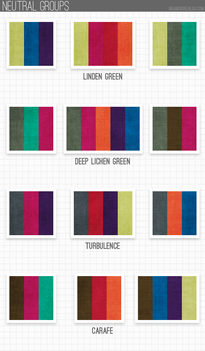
What I’m especially loving are the quasi-neutrals they included: Linden Green, Deep Lichen Green, Turbulence, and Carafe. I had a feeling those four colors will be so beautiful next to any and all of the other fall colors, so I starting playing with those first.
And I think I’m right – those neutrals/quasi-neutrals look fantastic with pretty much anything they’re paired with, which is great for color lovers like us since we can match up any other color to one of them and have it look good. Fall is usually when I start reaching for neutrals/quasi-neutrals more, so having more than one option is nice, too.
When I was playing with the swatches, I did have one surprise: I kept reaching for Vivacious a lot. I knew I’d be reaching for Samba and Koi, as those are deeper, richer versions of Poppy Red and Nectarine (which I’m a big fan of), and I love pretty much any blue, so Monaco Blue was a given. But Vivacious caught me off guard.
At first, I didn’t think I’d like it much, but the more I look at it, the more I think it’s beautiful. And it pairs really well with other colors, especially Deep Lichen Green, Turbulence, and Carafe. Those are my favorites to use with Vivacious because they really let it shine without taking anything away from it.
So while I obviously used Vivacious a lot, I also had fun pairing up the other colors, too (can you tell?). I can’t get enough of the blue-gray Turbulence, or the gray-greenish Deep Lichen Green. If I had to pick a favorite neutral, it’s a dark gray, so it’s fun to have two shades to play around with.
Your turn: what’s your favorite Fall 2013 color? Favorite pairing?


