
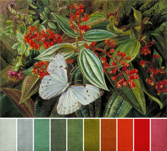
When I first saw this month’s challenge artwork, all I could see was the complements of red and green. That combo reminds me of Christmas, but it’s also a really powerful complementary color scheme. Red never looks more red than when it’s against green because they sit directly opposite each other on the color wheel.
But on closer inspection, there are more far colors in there. Not only is pretty much every shade of red and green involved, far more than what I’ve pulled out for the color palette, we also get touches of orange, brown, red-orange, pale blue, aqua, and a reddish purple, too.
This keeps it from feeling too Christmas-y (if that’s not your thing), and with how dark and fairly saturated most of the colors are, it also feels incredibly lush. Like we’re really in that Brazilian rain forest.
If you’re looking to replicate the color proportions exactly, your majority color will be green. Use as many shades as you like here, and keep them on the medium to dark side. The next major color would actually be that light blue, though red is close behind. The rest are pops or touches of color.
Tell me, what’s your favorite color combo from this month’s painting?
Jean
June 6, 2014 at 12:27 pmtotally love the image and am pulled toward the deep woodsy tones of moss green and red!
thanks for the inspiration!
jean