
I’m quite taken with this month’s challenge painting.

I love the use of colour: the cool, watery shades outside the window and the warmer, chalkier hues within the room. And yet, the distinction of inside and out isn’t really the primary focus of this painting. Far from being a depiction of spacial depth, it is more a study of composition on a flat ground, an arrangement of colour and shape that is not too many steps away from abstraction. And, if you look closer, you can see use of the ‘outside’ colours throughout the painting, and the same can be said of the warmer ‘inside’ colours. This brings coherence and aids the painting’s success.
These characteristics have lead me to focus more on colour than figurative forms in making my Etsy picks this month. I found a number of ceramic bead sets that bring together various shades in the painting.


This ceramic shard connector strikes me as being a good match for the blues and greens in Bell’s painting.

Or, if you’re more drawn to lampwork, here’s a couple of focals that could work nicely:


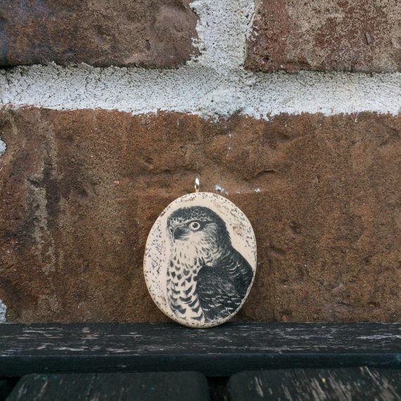
However, if you do feel more comfortable being lead by the figurative features in the painting, here’s a few pieces that you might use to reference the landscape seen through the window.


Pottery Girl
Bye for now, Claire
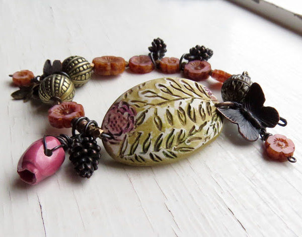
Mary Harding
September 8, 2015 at 12:55 pmLove your commentary on the painting Claire. Wonderful picks!! Thanks so much for including my Emerging Fern pendant!!
Julie Wong Sontag
September 8, 2015 at 6:21 pmOoh yes, great picks!! I'm quite smitten with the painting too… the colors are fabulous. I love the muted quality. xo — julie
Alice
September 9, 2015 at 1:25 pmI bought those beads from The Zesty Frog a few days ago. I hope they arrive in time.
Jean Baldridge Yates
September 10, 2015 at 4:52 pmVery good job on this, Claire!
Jean