
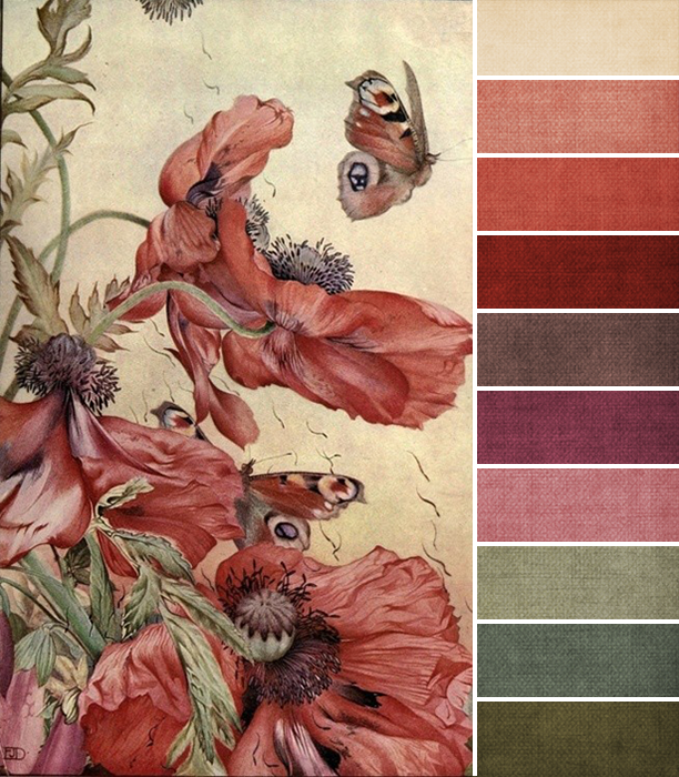
This month’s challenge piece comes from Edward Julius Detmold, and I love the reminder that spring is right around the corner, don’t you?
This month, you want to focus most of your attention on shades of cream and coral, as those are the most prominent colors in the painting. And there are a lot of shades of coral to work with, too, from pale and toned down, to bolder and more saturated. The creamy parchment background has a little variation, but not too much, and tends to take a more muted, grayish cast than pure, bright cream.
If you’re not familiar, coral comes from a mixture of red and orange. In this case, it’s definitely more red than orange, and again, the saturation varies depending on the shade. This is good news for you, since you may or may not like coral (until a few years ago, I didn’t), so there are some options here to play with if it’s not a color you feel totally comfortable using.
Beyond that, we also have shades of green, from olive to sage, and touches of a reddish purple. That red-orange/green/red-purple combination is called a split complementary relationship in color theory, so it’s naturally appealing to our eyes. This combination works because it’s balanced.
Overall, I’m really drawn in by this month’s color palette because we have a variation of values here, from pale to slightly dark. Which means you’ve got a lot of range to play with. Tell me, how do you feel about it?
Deb Fortin
February 5, 2015 at 2:05 pmthis is so weird that you are discussing the colour CORAL this month as it has been on my radar for the last 6 months or so. I have been drawn to this colour over and over again in 2014 and can't explain why as it has not been a favourite of mine but now I can't seem to get enough of it . esp with sage green or turquoise.
Love the colour palette. and the painting is very romantic to me.