
Welcome to Inside the Studio!
Each week one of our contributors gives you a sneak peek into their studio, creative process or inspirations. We ask a related question of our readers and hope you’ll leave comments! As an incentive we offer a free prize each week to bribe you to use that keyboard. The following week we choose a random winner.
Congratulations to Jan J!
You have won a $15 Gift Certificate for Ema Kilroy’s etsy shop.
Please send Ema an email with your information.
_____________________________________________________________________________
This week it’s my turn to give you a sneak peek behind the scenes here with me with Songbead and The Curious Bead Shop. What have I been up to this year? Well, maybe it’s my Monday Amuse the Muse posts, but I have been rather taken with Pantone’s colour of the year for 2015, Marsala.
I’m pretty sure you’re quite familiar with it now, but just in case…
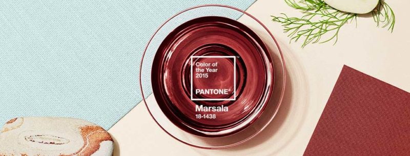
Are you a fan? I wasn’t sure at first, but I definitely am now. I think my family are quite fed up with me now – every time I spot it out and about, I have to point it out to them – look – Marsala cushions! Marsala gloves! Marsala plates!…..well, you get the picture. I think I really should confine my marsala obsession to beads and all things bead-related.
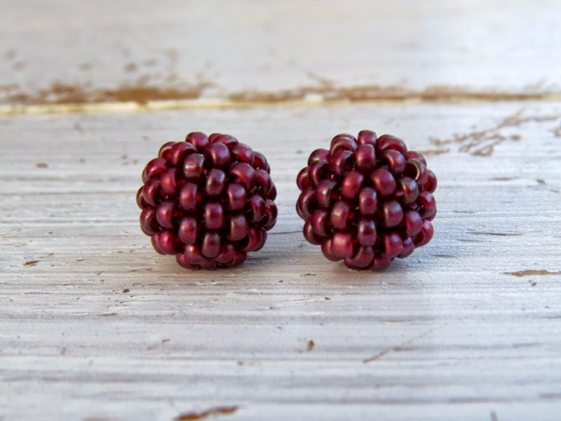
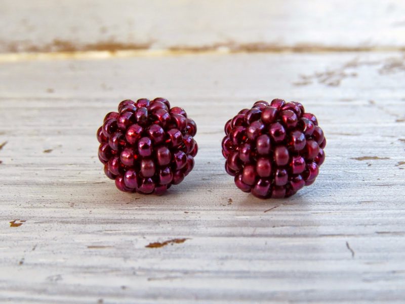
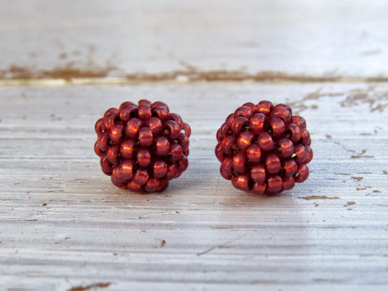
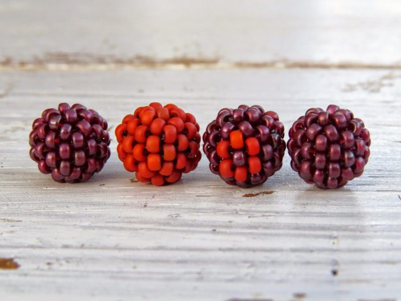
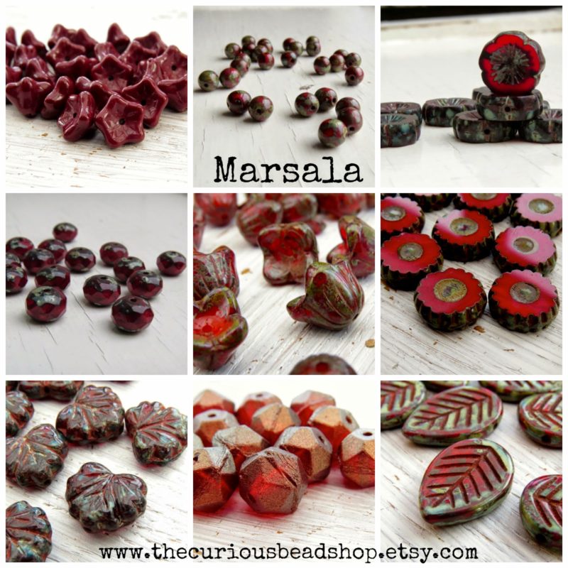
I haven’t actually got round to purchasing any new art beads in marsala, can you believe (January is tax return month here in the UK; I fear that may have something to do with my lack of beady purchases…) but I have stitched some beads of my own. It’s taken a little experimenting to find marsala shades that I am happy with, but I’m pretty happy with the ones I have made. Glass beads have a special way of changing colour depending on the light and what they are next to, don’t they? Here are the beads I’ve come up with so far:
I’ve also been thinking about which colours will go well with marsala. Not necessarily taken from the rest of Pantone’s Spring/Summer palette, although that is also growing upon me. I have never really got into Pinterest somehow, until this year. Since downloading the app onto my newish iPad, I am unstoppable! I can see why it’s always described as a serious time-drain. It certainly has been for me. Here’s the board I’ve created based on Marsala. Investigating it in this way threw up lots of interesting combinations and palettes. My favourite is without doubt marsala combined with amethyst, maybe with a little spring green thrown in:
I would never have put a deep rust-red with amethyst, but if you take a peek at my board, you’ll see these two colours paired together again and again.
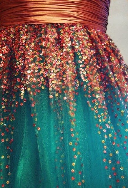
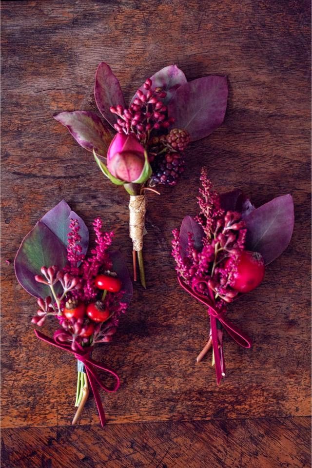
Here’s another classic palette – marsala, rust and teal. Another absolute favourite of mine.
Another thing I like about these two palettes is that the marsala red has been used sparingly – if it’s not your thing (yet!) you can still use it in moderation, although I think a healthier dose of it would work with both of these palettes too.
These two pictures I’ve shared above show contrasting shades combined with marsala (split-complementary, I believe…), but of course it works beautifully in a more homogenous scheme (analogous) as in the palette below:
(All of these images can be found over on my Pinterest board, with links back to the original sources.)
Here’s the little sampler of beads I created using a combination of rust and marsala:
I plan to make another couple of samplers using seafoam green and a nice amethyst purple, if I can find one. It’s tricky to find seed beads in good purples! You can find all of these handwoven beads available in The Curious Bead Shop.
Along with these handwoven beads, I have a few more beads from a marsala palette, some of which are brand new in with me for this year:
I’ve also made a few pieces of jewellery, at least partially inspired by the colour of the year:
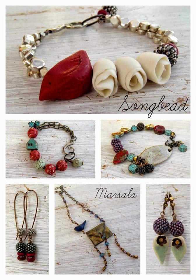
Most of these have flown away but the earrings on the bottom left are still available 🙂 More of a pinkish burgundy at work here; I’ve utilised another classic combination of burgundy and charcoal here. Another palette I plan to continue experimenting with and expanding upon!
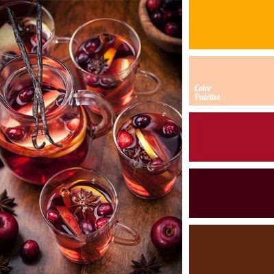
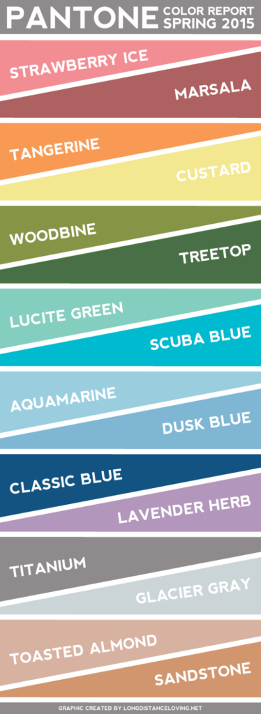
Here’s a peek at the other colours Pantone have selected for us for 2015 (again, it’s pinned to my Pinterest board):
What do you think of this colour? Are you inspired by/annoyed with/indifferent to Pantone’s Spring/Summer colours and their colour of the year? (I was seriously turned off by last year’s Radiant Orchid.)
All responses are valid! I want to know what you think about these colours. Tell me all about it to be in with the chance to win some handwoven beads in yes, you guessed it, marsala! I will send the lucky winner a pair of Lustre, Frosted and Opal Marsala handwoven beads. Leave your thoughts in the comments below.
Rebecca is a Scottish jewellery designer; currently living in Edinburgh, capital of her native land. You can read more about her and her work at her blog, songbeads.blogspot.com and see more of her jewellery at songbead.etsy.com. She also has a supplies shop at thecuriousbeadshop.etsy.com.
Shaiha
January 17, 2015 at 2:59 amI find that I don't really pay a lot of attention to the Color of the Year but it still tends to creep in. I didn't care for the Orchid at all but then I look around and it managed to sneak into everything. Now Marsala however happens to be one of my favorite reds so I am happy that I will be seeing more of it.
DESPINA VENETI
January 17, 2015 at 10:10 amI actually loved Radiant Orchid, I got myself a beautiful dress in that shade 🙂
From all the Pantone 2015 colors, at least as I see them in the photo above, I'm least excited with the Toasted Almond, Sandstone and Strawberry Ice – but then again the muted shades have never been my favorites.
I quite liked Marsala, but not in the exact shade I see in the Pantone colors photo, I love it in the deep, burgundy-like shade, like the one you used in your lovely designs 🙂
Best,
Despina
deb_oro@yahoo.gr
Saraccino
January 17, 2015 at 12:30 pmSome of the colours I already use, others are some that are ok but not colours I would gravitate to. But for me it is not whether I am really into a Pantone colour report but rather seeing it as a kind of challenge. Like my now long ongoing challenge with the colour yellow ^^And that actually is always inspiring to challenge oneself 🙂
sewandso
January 17, 2015 at 1:21 pmI am going to repost this excellent article. http://www.sewandso.wordpress.com
Katherine Thompson
January 17, 2015 at 2:22 pmYour Marsala inspirations are gorgeous! I was immediately in love with the color. I think it will be a winner!
Susanm
January 17, 2015 at 3:58 pmSince I am a big fan of reds, pinks and purples, I love this year's colour (I was ok with Radiant Orchid too) – it's so rich and vibrant. I really like how you've paired it up with other colours – the teal is my favourite combination. I will definitely be using marsala in my jeweleyr designs this year.
Karen L
January 17, 2015 at 4:00 pmNot fond of some of the Pantone Matchups. But like Glacier Gray and tree top with Marsala.
Debra Gibson
January 17, 2015 at 4:37 pmI hope I'm the only one who comments! I know that sounds mean but I want to win so badly! Lol! So the others better hurry if they want a chance to win cause this is one heck of a contest! I finally found a bead pattern to try and learn how to make these little beaded beads but frankly I fear I may have to purchase them in the long run because I have such a hard time with this type of beadwork. But I'm going to give it a try! I love your beads and have been a follower of your blog and work for several years. And your beaded beads have attached themselves to my beady heart! Take care and keep rocking your art !
Mokki
January 17, 2015 at 6:00 pmI love colour. I love seeing new colour palettes and how artists may use colours so differently to me. I don't like being told what colours I should be using though. Marsala is a lovely colour though. Quite a refined colour compared to the orchid purple last year.
Mary @ MaryMorrisJewelry.com
January 17, 2015 at 6:20 pmMarsalis being Pantoneso pick will push me to make more things in ed. It is a color I struggle with since it's not one I wear. Thank you for the ideas and your great Pinterest page.
Sandra
January 17, 2015 at 8:13 pmI very much disliked Radiant Orchid (and the year before, Emerald). Marsala, I love! And Strawberry Ice, and Tangerine, and Woodbine, and Lucite Green (Swarovski Green Opal, anyone?). Ya, I can definitely live with the colors Pantone picked this year.
Hugs, Sandra
beadlove
January 18, 2015 at 12:45 amI was initially indifferent, but after getting some materials in marsala and seeing posts showing it in different mixes (like the gorgeous one with teal in your post!) I have really come to like the color of the year and the spring palette. I've been very inspired to make jewelry using these colors.
Carolyn
January 20, 2015 at 5:11 amI would probably say I am indifferent to Pantone's colors. I buy beads in the colors that speak to me.
I love your beads and the Marsala colors are great. Would love to win a set.
Carolyn
Carolynscreations@live.com
Lyn Gulliver
January 21, 2015 at 8:38 amLove this post Rebecca. Marsala is growing on me, I can see possibilities with the muted colours, plus grey and Marsala. The Marsala, rust and teal sequinned skirt is just yummy. Spoilt for choice with this seasons report!
I am a bit of a "Pinner" and have just pinned a few more from your board. So just saying Thank You for sharing your inspirations.
Lyn
Colleen
January 21, 2015 at 2:10 pmI don't generally follow the Pantone colors, other than what is posted on blogs I read and the various beading magazines that I subscribe to. I like the Marsala color quite a lot in the versions that are a bit more purplish. The middle of the spring color report (glacier gray to lucite green) are colors that I like. And the two greens are quite nice and something I like to use sparingly.