
Welcome to Studio Saturday! Each week one of our contributors gives you a sneak peek into their studio, creative process or inspirations. We ask a related question of our readers and hope you’ll leave comments! As an incentive we offer a free prize each week to bribe you to use that keyboard. The following week we choose a random winner.
Hi, Happy New Year! If you see me out somewhere, shopping or picking up necessary supplies, try not to look at my hands. I am very hard on them when I’m in the studio, and this week it’s been especially messy.
I’m having a lot of fun experimenting with color and shape. I didn’t have anything particular in mind, the holidays, family visits and travel had kept me out of the studio for over a week. I guess the grey weather and the lack of nature’s colors during this season must have triggered a color shortage.
 You know how some folks need a boost of light in the winter when the days are short? I guess I needed a boost of color. My hands and nails (oops! there’s a streak on my wrist too!) are dabbed and dotted with color that isn’t always coming off. It’s been worth it, though. I’ve been creating some patterns, shapes and colors that are making my eyes smile and my heart sing.
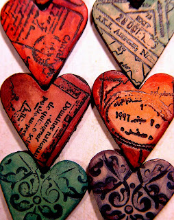
Speaking of hearts, with the loving holiday in February coming up, I did make up a bunch of the shapes that speak to our hearts. It’s a traditional shape with a long history, the little bumpy pointed heart shape.
I issued myself a color challenge, to see how many shades, tints and tones I could come up with using only the three primary colors and white. No black or brown.
So here are some photos of the colors that I’m mixing and using (and wearing on my hands in spots, at the moment) and I hope they perk up your post-holiday winter spirits the same way they have sparked up mine. And if you are the lucky winner, I’ll send one to you! Have you used color to enhance your spirits, by painting a room or knitting a colorful scarf, and are you playing it safe with your color choices or have you broken out your color experience lately?
My question for you for this week’s Studio Saturday is:
Do you prefer monotones, or complimentary colors mixed? Or just earth tones and neutrals? What’s your favorite color family to see used in jewelry designs?
Leave your comment, one lucky winner will receive a heart tile bead from me.
Posted by Lynn Davis who’s off now to soak her hands to get the paint off …
SueBeads
January 10, 2009 at 2:53 pmLynn, as you know, I LOVE your work! Right now, I am preferring the earth tones, I’m not sure why. I have been making beads in those colors lately – I guess maybe it’s the weather! I like greens in particular right now.
Thanks for your work – it’s lovely!
Sue
Heather Powers
January 10, 2009 at 3:11 pmlately I’ve been mixing bright colors with neutrals. I love playing with color too, so I probably do a little of everything you listed. My favorite class in art school was color theory. Have fun with your experiments!
EmandaJ
January 10, 2009 at 3:47 pmLove the post Lynn!
I love color, monochromatic, complimentary, triadic you name it. Mom loves color too and always seems to paint the brightest and boldest paintings in the deep of winter for the same reason as you — the crave for color when there isn’t any outside.
For me, I’d have to say monochromatic color schemes are what I’m focusing on right now. Rich, saturated jewel-tones are my favorites.
Emanda
abeadlady
January 10, 2009 at 3:56 pmI seem to alternate between earthtones and Jeweltones. Like you, I need the color boost in winter.
Arline
Kiwiken
January 10, 2009 at 4:32 pmMonotones are always pretty, but can become boring – complimentary colours are usually too much for my taste.
I just love to wear soft, muted colours like pastels, earth tones and neutrals, which all look even better spiced up with a little dash of colour.
That being said, I tend to “play it safe” myself, because I don’t have much confidence in my instincts when it comes to colour choices, and I’ve never really learned colour theory. I love and admire the bold use of colour in designs of others, and I would love to experiment a little more with this myself.
Teresa R
January 10, 2009 at 4:38 pmI say that I prefer earth tones and neutrals, but in truth, sometimes I see something that is either monotone or complementary colors or something wilder (such as bright crazy hues or metallics), but it’s done in such a way that makes me fall head over heals in love with it. My tastes are kind of unpredictable, I guess.
Gail W.
January 10, 2009 at 5:10 pmAll my life I have used neutral colors,in my home,my jewelry,my cloths.I’m not real good with color and play it safe.But I recently got a teal blue outfit and everyone said-thats your color!So,I’m trying colors.Jewel tone gemstones.2 gallons cranberry paint for a room.But I think I’ll always shy away from yellows and oranges.I’m going to begin trying the jewel colors.It’s my first step.
Tabmade
January 10, 2009 at 5:15 pmI like to be as colorful as possible at all time. 😀
Anonymous
January 10, 2009 at 5:15 pmI forgot to ask-who won last weeks Studio Saturday?I can’t find it listed anywhere.
Fab Fibers
January 10, 2009 at 5:16 pmRight now I’m wanting bright happy colors. Usually I’m more a neutral earthtone girl. I’m especially craving reds and oranges. I love your hearts, in every shade you have going.
Debra G.
January 10, 2009 at 5:43 pmI adore your work and the colors of your hearts are beautiful! I am a color girl it doesn’t matter and since I work with clay I am always looking for new color to mix ! Great Job !
Janel
January 10, 2009 at 7:52 pmMy favorite color combination is red, orange and yellow = flames. I also really love aqua blue right now. Maybe I’m craving seeing that color since the world outside is mostly white and gray!
Elaine
January 10, 2009 at 8:21 pmMy preference, in designing and wearing, tends to be mostly monochromatic colour schemes or monochromatic + 1.
I’m not unconfident about mixing and matching colours and some of my monochromatic schemes are eye-popping red-orange-yellow ones – it’s just a simpler way to work, for me.
I still lean heavily to blues and aquas or blacks and greys for what I wear but I have the slowly blooming section with reds, browns, golds…
AJ
January 10, 2009 at 9:26 pmI like earthtones with green mixed in. Or green with earthtones mixed in. Or jewel tones accented by black.
Love your hearts, they have a nice vintage style!
Cindy Gimbrone
January 10, 2009 at 10:16 pmSweet hearts, Lynn. Love the colors- marvelous work with such a limited color palette!
I think winter gets a bad rep as being colorless, though. I’ve been driving to work just before sunrise to be greeted with the most amazing fuschia, gold and blue sunrises. They are truly magnificent in color and the dreary Northeast isn’t known for it’s spectacular sunrises. I’m glad that I get to see them.
So, winter’s reputation is colorless because we miss the color in it! But that’s not to diminish the happiness of the colors you’ve made into hearts!
Sweet!
Cindy
Cindy Lietz, Polymer Clay Tutor
January 10, 2009 at 11:20 pmI must be a magpie or have color ADD cause I love them all! I see something like your hearts and they become at that moment my favorite color… then I see some clear bright undiluted colors and love them too! Color is such a fascinating and inspiring thing for me. It is possibly why I was attracted to polymer clay in the first place… the color possibilities are endless!
rosebud101
January 11, 2009 at 12:24 amI don’t necessarily look at a color palette, but I do love bright colors! Even in my beads with the more neutral tones, I have to add, at least, one bright dot. My art flows around bright colors!
Jamie
January 11, 2009 at 4:23 amI love earth tones, but I also am really loving designing in pinks right now, perfect for spring and Valentines day!
Lisa Martin
January 11, 2009 at 5:09 amI like to use all colors, but probably my favorites are soft and subtle shades, esp. of pinks and purples. I especially like tranlucent, opalescent too, and beads with texture, and also metallic colors!! Love your hearts, and the colors, they are darling.
Judibeads
January 11, 2009 at 5:26 amI tend to stay in the purples and blues, changing hues to suit my mood!
Judi
Connie
January 11, 2009 at 7:05 amI’m pretty eclectic with my colors…black and red and white are my favorites – but i”l do blues with purples too…i love “blends”, and tuscan colors too!
connie
Katie Nelson
January 11, 2009 at 2:42 pmI never know what I like best because I always seem to find some other color combination that I love…I do tend towards jewel tones…Rich, deep colors make me happy – I can even go with brighter colors, I just love it when the colors really seem deep…
The hearts are wonderful!
Sandi M
January 11, 2009 at 3:41 pmYour hearts are AWESOME! Love the teal one – the color of my kitchen.
They are all beautiful. As for me, I like bright colors mixed with the neutrals. I wear alot of black as a background for my jewelry. I also like to mix colors to keep everything lively.
Thanks for sharing your great work!
Suanough
January 11, 2009 at 4:53 pmLove your hearts…
I love spectrums of color. From yellow thru forest green, or pink thru magenta, or magenta thru purple. I try to incorporate many colors from a spectrum in my work.
Thanks for sharing,
Suanough
silkenlariat.deviantart.com
:-) MaryLou
January 11, 2009 at 4:54 pmMy color preferences are all over the place! I tend to wear a lot of black and white, rarely red or any other bright color. My jewelry designs, though, range from simple monochromatic blends of beads to wild color combinations. It’s great fun to experiment, and I find myself reaching for different beads based on the weather or my mood.
The heart beads are wonderful!
Fanciful Expressions
January 11, 2009 at 5:35 pmAs you know, I love all of your beads.For the most part I love red~~~all the time.I favor jewel tones most of the time~~~blues,greens,purples, anything bright and happy.
Jan Pittner
January 11, 2009 at 5:37 pmLynn, I tend to prefer cool colors. I love blues and greens together with a splash of a bright warm tone mixed in.
I loved your hearts ~ so fun, not typical!
CreekHiker
January 11, 2009 at 6:01 pmGosh, that’s a tough, tough question. It depends on if it’s something I’m making for me or planning to sell.
For myself, I like really simple but stunning beads. Big hollows with a little floral. I will layer transparent colors for the base bead and mix opaques for the florals.
For something I plan to sell, it really depends on my mood. With the economy what it is, I struggle with the time I spend mixing colors because I don’t think it’s appreciated in the current market.
Hannah B
January 11, 2009 at 6:37 pmBeautiful heart beads! I try working in various color schemes, but I always seem to come back to jewel tones. I especially love deep purples.
Dini
January 11, 2009 at 8:13 pmDon’t make me choose!!! They’re all “yummy” and fun and wonderful and each different colors sets my imagination on fire. Looking at my own shop, I guess I tend to tgo for the natural colors first because then I can ADD a chosen accent color to my piece. But, often times I started out with a color pendant (say like a red heart) and create the rest of the project around it in a more
wearable” pallette of colors, still using the red accentr throughout to tie it in together. These are such fun – I say “go for all the colors!!
Dini
Beadazzled of Oregon
Phyl
January 11, 2009 at 9:24 pmLordy, those heart tiles are GORGEOUS!And give me bright, cheerful COLOR in ALL my artworks…winter-time especially!Reds and
purples and turquoise, etc.
The older I get, the more COLOR and BLING I want!
Thanks for sharing…….
Sharon
January 11, 2009 at 10:17 pmLove those tiles and the eyelets lend such a vintage feel. I usually like rich jewel tones like emerald green, royal purple, etc, but now I’m into raspberry and pinks, brigt cheery colors!
paula
January 11, 2009 at 10:33 pmAhhh, working with mixes of yellows and oranges and coming up with peaches just makes me feel GOOD!
Paula Leone M.
January 12, 2009 at 3:10 amI think those hearts are fab. Beautiful work. Like you my hands look pretty bad because of my work. Colors or colours that work for me are… pretty much everything. I seem to prefer complimentary colors in my work but there are times where monotone works better in a design, and I have to admit I love both earth tones and bright warm hues. I guess that’s why I use Dreaming in Colour for my little jewelry biz.
Paula Leone
Cindy Ericsson
January 12, 2009 at 3:32 amI’ve never met a color I didn’t like, but there are a few that I don’t wear, like brilliant, clear oranges. I guess earthtones and neutrals are the most wearable, but I tend to think of many blues and greens as neutrals, too. The hearts are quite lovely.
Donna
January 12, 2009 at 1:34 pmJeweltones. Almost always.
Lynda/SCDiva
January 12, 2009 at 5:39 pmI love the tertiary colors in their various strengths and tints, from the tomato red, mustard, sage, pumpkin, aubergine, indigo, iolite, etc.
beadsinbeauty
January 12, 2009 at 11:42 pmI like blues and greens the best because of my deep affinity for the natural world . Water and sky. Ocean and Forest. Lots of tints of blue and green to be seen!LOL I also love black tones because of the “Land of the Midnight Sun” from which I originate. Hematite black and white silver-lined seed beads are my favorite combonation if I really had to choose!
Carly
January 13, 2009 at 3:44 amI see myself as being eclectic in color combinations both in my clothing and jewelry design. Overall I prefer the brigt “cool” colors with a splash of earth tones
TammyG
January 13, 2009 at 3:26 pmIn the past, I’d have said I prefer monotones. Except what keeps jumping out at me are complimentary colors, and monotone pieces seem…. bland. I’m especially drawn to purples with topaz or gold
LLYYNN
January 13, 2009 at 6:16 pmWow, you guys are great! There are as many color choices as there are people. I lean (for myself) more toward the warm colors, the tuscan golden siennas and the vibrant red-browns, but I’m making myself branch out more and use the cool colors too, the lilac-blueberry-emerald shades.
It’s been so fun working with this limited color palette. Sometimes I think I distract myself with all the choices, by limiting what I am using I am making myself be more conscious of what each color does. And by using the same three colors combined, I’m learning a lot about how they affect each other.
I recommend the exercise in color, if you have time! And thanks-thanks-thanks for all the kind words of encouragement!
Mayelle
January 13, 2009 at 6:50 pmMy favorite colors are yellow and green, but I can love pieces in many colors or neutrals. I like colors that have some “life” in them without being too overpowering. I like pieces with several different colors, but various shades of one color can also be gorgous. Intense blue and black are about the only combinations I really dislike. I am being drawn to more warm, bright colors this winter.
JackieW
January 16, 2009 at 3:23 amFirst let me say your hearts are great! My preference to colors change depending on what I’m looking at. The last two pieces of jewelery I bought were coppery, bronze and black with silver.
But then I’ll go buy a bag of multicolored beads becasue they’re beautiful! My fav color is green and I’ve been liking the feeling of purple the last few years.
So go figure?
BTW….I Love hearts!
Gaea
January 17, 2009 at 2:36 amI have to pick one? I’m a color whore! But do tend toward complimentary colors. Sorry! That was a bit off color! Tee hee! I heart your new hearts!
Anonymous
January 17, 2009 at 7:45 pmOnce I saw all the red hearts,I went to my beads.The very last drawer was filled completely with reds,yellow & oranges.I made myself make a necklace out of red,and for a few days made something red.I like the bright colors better,now.But I won't wear them.